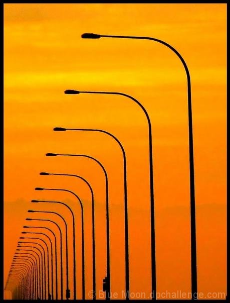
Taken on the San Mateo bridge while driving(well, I was in the passenger seat). It wasn't really a sunset, I just made it look that way. Edit: I cropped, changed the overall color temp of the image to very warm a.k.a. orange, then saturated it a bit, brought down brigtness, the contrast way up, applied neat image, added border, saved to web.
I think this could go either way. It will either do bloody awful, or people will love it. It might not be as much of a pattern as other entries. The more and more I look at it, the more I like it, so hopefully the voters will too. I also hope it doesn't look too fake.
:::After Challenge:::
WOOO-HOOO! 5th place! I'm so happy, especially since I haven't even gotten into the top 10 before.
I still don't like this one as much as most of you apparently do, but hey-I'll take it :)
The artifacts are from it being a really noisy image before I applied neat image, but neat image did not getting rid of the noise in the tight spaces. There wasn't really anything I could do about it.
By the way, how many of you spotted the disruption in my pattern? a.k.a. stupid seagull...
Thank you for voting and for your comments!
Here is the original:
Statistics
Place: 5 out of 250 Avg (all users): 6.9351 Avg (commenters): 7.5238 Avg (participants): 6.6190 Avg (non-participants): 7.1156 Views since voting: 3949 Views during voting: 383 Votes: 231 Comments: 37 Favorites: 8 (view)
Just cruising around, reading some profiles and looking at images. Got on your profile page via Alices cause she mentioned that you took her current profile photos. I read that one of your goals was to receive 2500 comments....I scrolled down and this image jumped off the page at me! so I figured I'd help you with the comment goal.
I love this; it's beautiful! Read your notes - stupid seagull lol ;-) I probably wouldn't have noticed it - but then again I was looking at the photo - didn't even know what challenge it was till I read the notes.
Hi Leah. I've admired this shot many times, so decided to comment at last. :)
I think this is a great example of taking an interesting composition and then making it sing through editing. The "real" colors really don't matter here.
As for noise at ISO 50, I've had similar problems with the same camera. It usually happens in the sky.
I love your photo 'Vortex to the Sun' and I am wondering how you changed the overall color temp as you mentioned. I really like the effect and would like to try it.
great point by JDanniels below....definitely make sure you aren't compressing your images too much b/c it will cause those artifacts. Great image here though...love the repetition, color, and lines.
Hey I have been on that bridge many times, long and flat! Congrats on your PB, although a bit late. I was just looking at your photo and noticed how small your file size, 31 kb, And you can use up to 150 kb. I think this is why your photo has the artifacts, because I don't think ou should have any noise at ISO 50. I am not sure what software you use but whatever they have for Save for the Web or equivalent will strip the exif from the photo and allow a bigger file size.
Congrats on 5th place!
Leah,
Congrats, congrats, congrats on your high finish. Very much deserved for this interesting persepctive and wonderful vanishing point.
Not sure you suck enough for Team Suck, but glad you're with us all the same :-)
Composition is great! The verticals are not aligned, and better focus would have really enhanced this image. Sharpening artifacts would not then be evident. Please shoot this again, and report back!
I really like this shot and it perfectly suits the challenge. I lot of messiness around many of the poles (grainy dark smudges) but not much you can do about that in basic editing so back to bump you up to 8.
Ahh too bad there are some artifacs in the image. i would have really enjoyed this if it was ultra smooth Very nice concept and composition for this piece.





 Add photograph to your favorites
 Add photographer to your favorites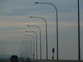


 Photographer found comment helpful.


