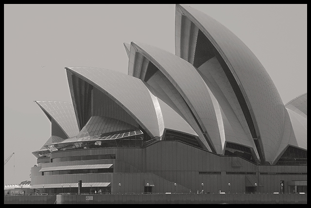
Perhaps because I have seen so many other great photos of this building (and therefore and am comparing)or because the images appears dull because of the bw/gray aspects of it, or because I want to see the pattern of the vertical lines on the side of the building as well, or because you have cut off the top of the largest sail with your border, or because the little crane on the left is distracting, I find this picture to be just "average."
this could be a very good image, but the b/w conversion is a bit flat. a wider tonal range would serve this well - having a tue blacka nd a true white in the range, rather than just the mid-greys, wuold really make the pic pop.
Very poor contrast. Your cropping allowed a crane on the left and left out something more interesting on the right side. As well it cut the top of the highest structure.







 Add photograph to your favorites
 Add photographer to your favorites


 Photographer found comment helpful.


