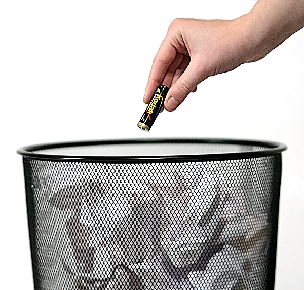
Hey, I saw this in the underrated thread. I didn't vote in this challenge, but I like the shot, and you seem interested in real comments, so I thought I'd chime in....I would have given it 6. The message is good, it's nice and sharp (maybe a bit too sharp), and it's original. I like the simple composition, probably because I tend to do the same kind of thing. I think there's a couple of reasons it didn't do better. For better or worse, in DPC, it only takes a couple of minor technical issues to drop the score a couple of points. The focus issue that Puckzzz mentioned, the out of level trash can, and the oversharpening probably took a full point off of your average. The other thing is that the lighting is a bit harsh. I think the other thing that might have hurt you is that people had to read the title to understand what the picture is about. I don't know how you would do this theme another way, but a lot of people only look at the picture for a couple of seconds. If they have to do any reading, your score will drop.
As promised my explanation as to why i gave it a 4.
the focus seems to be on the edge of the bin and not the battery. The idea is okey but a bit simple. There were a lot of photo's that were very simple. Now that is not allways a bad thing but they didn't apeal to me. it's also looks a bit oversharpend.
So there you have it, not really that many reasons but enough for me to give it a lower score. I tend to look at details like that. I hope you find it constructive and helpfull to take with you in your next challenge :)
I like this. Good message, clever idea, proper composition with your placement of key elements. Only minor complaint from me is the slight tilt of the wastebasket. Best of luck to you in the challenge.




 Add photograph to your favorites
 Add photographer to your favorites


 Photographer found comment helpful.


