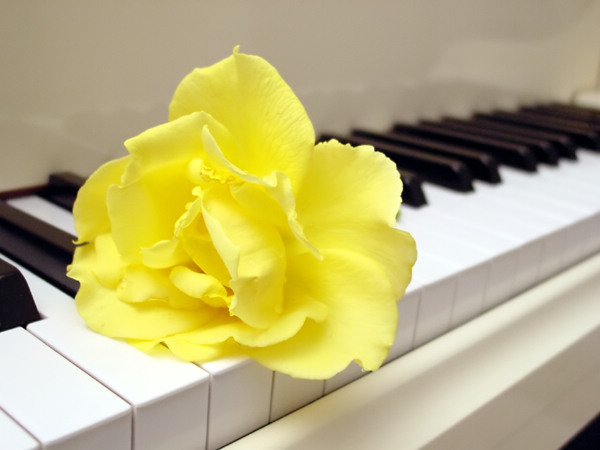
Good framing (except little triangle bottom right) and, specially attractive comination of colors. The rose is a bit overexposed and lacks of sharpness, although the focus seems ok (based on the keyboard). Seems that it's the yellow brightness who make the rose blurry. Could easily be arranged with Photoshop or equivalent.
The delicate tones and colors of the rose are captured very nicely and the piano makes a great background. A black piano would have been a lot more dramatic, but the white piano keeps the image high key and better fits the challenge.
I like the composition and the simple but beautiful colours! :-) Maybe it could be a very little bit sharper behind the flower, a slower blurring would do fine.
Great photo, everything done to pass fillings of grace and beauty. Especially white piano “sounds” notes of something in a hard. This is a winner photo for me.
Beautiful setup, I think it would have been nicer if you made some color adjustments on it and put some more blue and cyan in it, and mabey have the picture a bit darker :o dont know... Good luck :)
Nice idea and good colour choices. I would have picked yellow too instead of a red. A red may introduce too much contrast between the white and black keys. The flower seems to be incomplete though, it stands out beautifully with just the right amount of soft focus but without a stem and a couple leaves, it seems something is lacking. 7






 Add photograph to your favorites
 Add photographer to your favorites


 Photographer found comment helpful.


