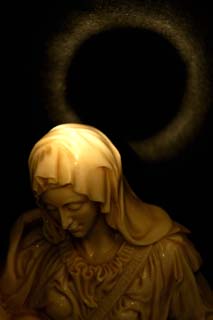
You chose a prime subject for this contest, for that I give you props. I really like the lighting on the statue, there are just enough highlights to contrast with the shadows, creating nice depth and texture.
The halo seems like it might be a bit much for this image. I see what the idea was, and it's a good idea, but I'm not sure it works for me in this instance.
Framing is good, as I understood you wanted to keep the halo intact.. Light on the top of the head is a bit overexposed and washes the shawl texture, while there could be more light and sharpness on the dress. But it shoul be limitated to keep the feeling of heaven\\\'s grace present.
My eyes keep getting drawn to the black in the center of the circle, but I don't think that's what you were going for. Maybe show more of the statue? I like the duotone and the light on the statue's head. And now I'll go visit a shrink and try to find out why I'm drawn to the darkness . . .







 Add photograph to your favorites
 Add photographer to your favorites


 Photographer found comment helpful.


