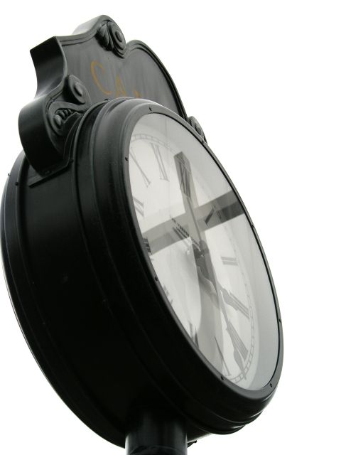
I wish that the image was all grayscale/BW. the colored writing at the top (looks like gold?) is a little distracting, but nice use of curves, notion of time and the truth. Yea I know someone will probably be made uncomfortable by the statement made by this photo and my comments... oh well, get over it and face the truth.
Interesting concept. I think it would be even more effective if the horizontal beam of the cross didn't stretch the whole span of the clock face. I like the black and white and the solid white backdrop which really emphasizes your focal point and you have very nice clarity of the details in the face. Perhaps crop it so that you have just of white behind the clock so that it doesn't butt up so precisely to the border.







 Add photograph to your favorites
 Add photographer to your favorites


 Photographer found comment helpful.


