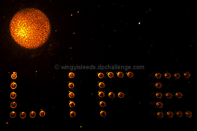
Taken on my granite kitchen worktop. Mars is actually a reflection of the ceiling light and it was purely a mistake, was just going to shoot Battery Life, but when I saw this I thought what the hell..;-)
Shot in RAW
Levels, Curves, USM, Crop, re-size.
Thank you all for your comments ;-)
Statistics
Place: 59 out of 142 Avg (all users): 5.4185 Avg (commenters): 6.3333 Avg (participants): 4.8000 Avg (non-participants): 5.5591 Views since voting: 1297 Views during voting: 452 Votes: 270 Comments: 8 Favorites: 1 (view)
Well, how's that for coincidence!! Hope you are keeping well :o)
Composition:
I really like the idea you 'stumbled' across here. I may have been tempted to put the word 'life' in a semi circle around the 'planet' to give more of a 'life on' impact. Also,for me, I would like to have seen a little more clearly that the word 'Life' was made from batteries so possibly a different angle would have shown this offer better?
Technicals:
I'd like to know why you chose to use your kit lens and not your new macro for this challenge? I can't wait to see some macro stuff from you soon! This shot seems a little out of focus to me. Do you use a tripod? Also, although the colour on the 'planet' is good I think the lighting on the batteries is a bit dull and could possibly have benefited from a small lamp directly on them? (just my humble opinion!)
If you've got any questions about this critique, please feel free to contact me via the PM system.
Its cool how you've use the subject of the battery in a very non-traditional way. We can't tell that they're batteries, and that's actually a good thing here. However, it just doesn't make visual sense. Nothing is actually ON the planet in this picture, and it stumps me as to why a big L-I-F-E would be in space.
Cute idea. Almost forgot for a minute that this is a AA Battery challenge when I was thinking about your setup for this. For the life of me I couldn't figure out what kind of pushpins you used. :D Couple of things that would make this stronger for me. The lighting, if more uniform across "LIFE", would be better IMO. The "stars" could stand to be more like pinpoints and lose the slight blur. Overall, nicely done. Good luck in the challenge.
I took a shot with a similar setup for this challenge, so I know what you went through trying to get things looking right. It's a neat idea, and I think given a better setup this picture would have done pretty well. Unfortunately, though, things are not in focus and a little rough on the eyes.






 Add photograph to your favorites
 Add photographer to your favorites

 Photographer found comment helpful.


