Challenge:Something New (Classic Editing) Camera:Canon EOS-D60 Location: Amettla del Mar, Spain Date: Aug 9, 2002 Aperture: 16 ISO: 200 Shutter: 1/3 Date Uploaded: Aug 11, 2002
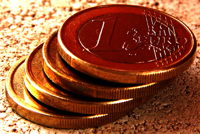
Having spent the last couple of weeks in Europe, I couldn't help but notice that people are still struggling with the fact that the Euro (which was introduced at the beginning of the year) has replaced the local currencies. Although all transactions are now in Euros throughout the EU, in most stores prices are still given in the old local currency as well to give people a reference. This macro shot of used Euros (new ones are hard to come by) was shot on a window sill with overcast skies. I used a 135 mm zoom on my 28-200 lens which allows to do macro at about 6 inches. In addition I cropped the shot to only have the coins fill the whole picture. I increased contrast and saturation. In terms of lighting I used a book to avoid getting the silver surface to reflect the sky and only get the outline of the "Euro" text. (Shot on tripod.)
Statistics
Place: 78 out of 168 Avg (all users): 5.0353 Avg (commenters): 5.6875 Avg (participants): 4.9070 Avg (non-participants): 5.1667 Views since voting: 1033 Votes: 255 Comments: 16 Favorites: 0
These coins we either sitting on a piece of cork board, or a hamburger. It's definately got some interesting texture. I like how the coins are set up like that. The angle is nice, however there seems to be a distracting bright spot towards the bottom left. I have heard of a trick to lessen bright spots and make the lighting more balenced out. Try putting a thin piece of cloth or thin paper between the subject and the light source. Still lets the light through but not as harshly. You can also use different colors of cloth or paper to create some really neat color effects. Good luck in the challenge.
I like thgolden cast of the entire picture. I am not too impressed with the lighting..The shadows seem too dark and the flare areas too bright. overall it is noci work though. =5 syamjonimi
Nice layout and subject. The only thing I would've done different is pick a less distracting background. The way you have your lighting set up it gives the background a lot of contrast and distracts the eye from the subject. I'm wondering if the coins are sitting on a rice crispy ... (I think I'm just hungry) ... sorry ... lol
Interesting coins, kinda reminds me of some french coins I have (the two tone color coins). Speaking of color (or is that colour?), are the coins really this dark bronzy color? I was expecting lighter outside rings, with darker inside rings (than what I see here). Very sharp w/ WIDE DOF, very, very nice. I am going to bump your score up one from 7 to 8 (for a euro, I'll go one more!) Swash
Great idea – I haven't seen a Euro yet… It meets the challenge. In my opinion, I think the colours of the background and subject are too close creating a cast. This may be due to white balance, but whatever it is, it doesn't seem right…
As a Euro babe (but not in a country with the Euro) I like this idea (though I do really miss the French Franc, I don't miss the Lira or Peseta). I find this a little too contrasty though. Is that how it was taken or have you played with levels? I love the sheen on the coins and the real golden highlights. 6, Kavey






 Add photograph to your favorites
 Add photographer to your favorites


