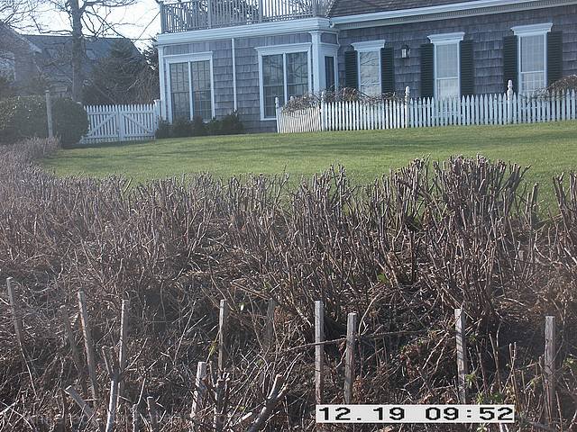
Date stamping is very unatractive and I thought not allowed. The picture is rather blah, too much dead twigs and the house is chopped off at the top. Either include all or none of it. This is a tough one to portray in the winter when most is dead. Not meaning to be harsh, and hope that helps, please keep at it!
Nice house. But as a landscaper(?), I'm fairly certain that you should be able to find some nice looking shrubbery even in winter. Would also be better without the timestamp.
I am sure many people have already pointed out the cropping of the time bar or even disabling it. I think a slight curves adjustment would really allow this image to shine more. I like the perspective, but it also doesn't tell me your occupation or what you spend time doing.
Some suggestions for this one:
1) level your horizon
2) turn off your date stamp (those things get you DQ'ed, I'm surprised that hasn't happened yet)
3) I am guessing that the haze was caused by sunlight hitting the lens. A lens hood would have avoided it, but a little tweak in curves does wonders for this photo after the fact.
4) If you had positioned yourself so that you created some diagonals, you might have ended up with a stronger composition.
I was going to say that you ruined the picture with the date stamp. Then I saw the picture. Dont worry about the date stamp.
Where is the subject? This is just a picture of a garden. The picture is also flat and needs contrast. And yes date stamps, never use them in a competition, never use them at all. They are ugly and mess up the photos.
I think you're destined for a poor score, because you needed to crop out that date mark. I'd recommend turning it off for future challenges. I mean, generally I'd recommend turning it off completely in any case - for digital shots it simply isn't needed, all the information about time of shot is recorded with the file itself anyway, without spoiling the photo.
So, that aside, what do I think of the photo itself? Compositionally I think it could benefit from re-framing. The house in the background slopes off diagonally, and you really need a flat horizon. The photo is over-dominated by the brown trees (I think) in the front, and I don't think it's very well balanced by the house. If you're stuck in winter and wanted a garden shot, I'd have probably tried to find something evergreen, maybe with berries or similar, to keep a bit of colour.
Then, along the top, it feels a bit cramped. So much is in there! The part of a house, the bottom half of a tree, and a section from a second house. It's both too much and not enough at the same time. Neither component is framed fully.
Lastly either the light or your camera has not been favourable in terms of colours. There's a general washed-out appearance to the shot, it all comes across as being pretty muted.
I think if I wanted this shot, I'd have lifted the camera more, to take in less ground and a bit more of the house, and levelled everything off. Then either shoot at a different time of day for more features, or bump up the colour in post.








 Add photograph to your favorites
 Add photographer to your favorites


 Photographer found comment helpful.


