Author Thread Comments Made During the Challenge
Post actions
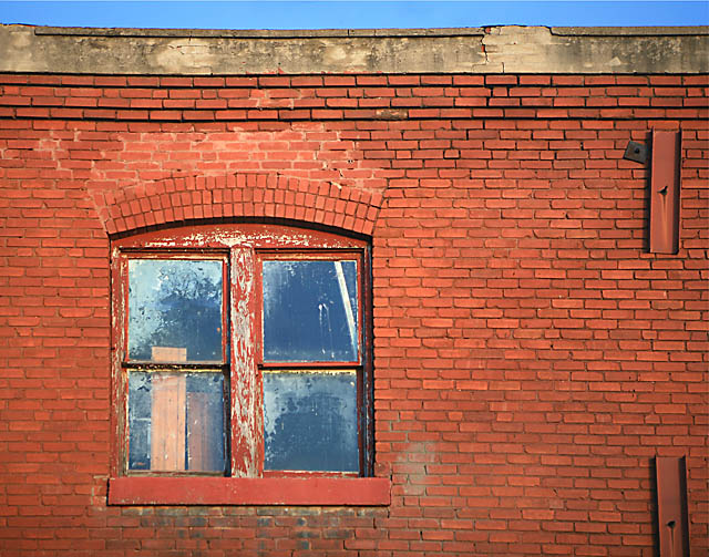
Might have been better if the strip of sky had been left out. It doesn't fit with the patterns in the bricks. Otherwise, it's a good shot.
Post actions
Hmm i like this, the strip of blue sky at the top adds a little extra to this picture. 6
Post actions
Post actions
try to crop out the blue sky, no?
Post actions
This image appears tilted - it would have been better if it had been straight.
Post actions
I'd like to see the contrast boosted just a bit here ... great composition and subject ... the wall anchors really balance the window out ...
Post actions
I'd crop the upper part. Nice.
Post actions
Awesome study!
Post actions
Light on the wall around the window is really nice. Maybe the sky should be cropped.







 Add photograph to your favorites
 Add photographer to your favorites


 Photographer found comment helpful.


