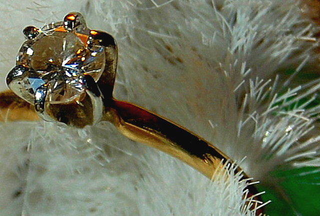
Well this would have been a nice shot but the image quality is pretty poor, it would have needed to be clearer, more contrasty with sharper colors and better lighting to grab my attention, sorry. Also, including the green in the lower right corner really doesn´t help and would never fly in a real advertisement for a ring as it only draws attention away from it. Sorry but as it is I voted this a 3 but fix the lighting and image quality and you might be on to something.
hmm too much sharpening or just a lower quality image - - maybe from resizing for the web? Lighting for jewelry is tricky too and there are some awkward reflections on the stone.
Lacks real detail and quality - either resolution, processing or cropping has lead to a blocky feel to this image. The composition is kind of effective - not as effective as it might be because of the green background image right, and your control of the reflections etc. in the stone is poor - to give a real sense of ping from a jewel requires careful lighting indeed.






 Add photograph to your favorites
 Add photographer to your favorites


 Photographer found comment helpful.


