Comment:
Hello from the Critique club, my name is Jon Rowe, and i will be looking at your image this evening :)
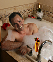
Composition/Lighting : the lighting in this image really seems to be great. you have the main light at the right angle, and the shadows on the opposite side are very nice, w/out losing detail. as i stated when voting, this image is incredibly too small. if it was tripled in size, more detail would have come through. i'm afraid that when an image is submitted this small, voters dont' waste their time and just vote it low b/c of the size. crystal left you a great link to a tutorial, if you use that in your next challenge, i believe you will have better luck w/ the voters.
Challenge : this is very humorous. if he's retired, i can see how this would fit the challenge. it shows his relaxing, and enjoying his time off after years of hard work. but, i have to guess if he's retired due to the lack of detail due to the small picture size
Conclusion : overall it's a very good image, that was lit very nicely. if this took full advantage of the pixel dimensions, i think this would have been a 5.5 - 6 image easily. good luck, and let me know if you have any questions about my critique.
hilarious shot. love the idea! I'm sure some people will find problems with the exposure on his face, but kudos on the creativity and the execution! Cheers
no offense meant whatsoever, cause i'm sure you will read it from multiple people, but if you took full advantage of the 640 pixels on the long side, your score would increase by at least 1 - 2 points. way too small. great image though :D






 Add photograph to your favorites
 Add photographer to your favorites


