Author Thread Comments Made During the Challenge
Post actions
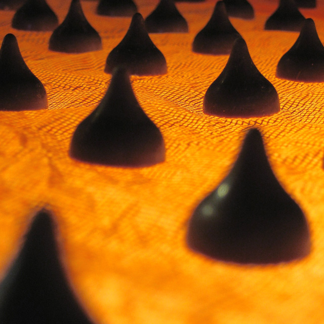
I like the arrangement of the kisses. The fabric/color distracts. Maybe try lighting from above as well.
Post actions
nice idea. lower your f stop to increase depth of field and sharpness. would have liked to see more visual separation in the kisses, so one is not directly behind the other in the shot.
Post actions
I find the out of focus kiss on the left to be distracing - it could have been left out.
Post actions
There doesn't seem to be a focus point.
Post actions
Very creative shot! Made me stop and look. I would have preferred a better depth-of-field though.
Post actions
Like the idea of the lighting from the bottom. Don't like the unsharp chocolates in front though.
Post actions
Would be better if focus was on one of the two whole cocolates towards the the front I think.
Post actions
I like the idea, but not the focus. Also the brown isn't very brown on my monitor -- sort of black with magenta highlights.
Post actions
The lack of focus in the front is extremely distracting.
Post actions
Focus is off or something - kisses are very fuzzy
Post actions
the bottom half is way too blurry for my taste
Post actions
they look black on my monitor ...
Post actions
After voting in this challenge, I may have to go and get me some chocolate! Dang it. I was doing so well too. *grin*
Post actions
I don't think there's a way to fix this one. It's a neat effect, but there's no focus on the kisses. Good luck.
Post actions
What is supposed to be in focus here? I think you went just a little overboard with the depth-of-field.
Post actions
The kisses seem really dark and they actually look black rather than brown.






 Add photograph to your favorites
 Add photographer to your favorites


