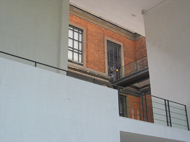
Challenge:Something New (Classic Editing) Camera:Canon PowerShot G2 Location: the Danish national gallery Date: Aug 13, 2002 Aperture: 3.2 ISO: 100 Shutter: 1/125 sec. Date Uploaded: Aug 11, 2002
I love the warm tones of the brick here, and the contrast of the white walls is good. Even has some nice strong lines. I'd like to have seen it cropped more tightly around the brick...since I like brick. With all that white wall, the brick still shows some detail..no ez task!
To me, this is visually unapealing. with all the flat white, the focus seems to be the dark part of the building. that's where my eyes are drawn, to the dark part of the building, and that part looks very old. however, in comparison, the dark part makes the white part look new, which is what I think was the message you were trying to come across with. however, being as that my eyes are firstly drawn to the old part of the building, that's what I see first and the image I get is old, not new.
very cool compostion. i love all the geometric lines and shapes going on. if you could pull some of the cyan or blue out of the walls and bring to a more pure white and then saturate those red bricks this could have much more impact. good eye. keep it up.
I love the composition of this photo, although the subject isn't really very interesting to me. I think I would have liked it better in black and white, to really throw the emphasis on the shapes and contrasting textures. Nice idea though!
I don't know what it is but there doesn't seem to be a lot of interest in this shot...maybe if it were b&w it would be a little more dynamic? The light in the window is a little distracting also...






 Add photograph to your favorites
 Add photographer to your favorites


