Editing steps:
1. Croped
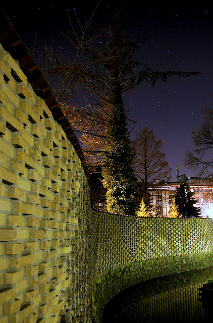
2. Lots of Histogram, highlight&shadow and contrast adjustments to bring out the wall and the sky without blowing out the allready bright spots.
3. Decreased Temperature to 6500K and removed color cast.
4. Saturation on Yellow.
5. Resize and USM.
Statistics
Place: 43 out of 151 Avg (all users): 5.9906 Avg (commenters): 7.0909 Avg (participants): 5.6842 Avg (non-participants): 6.1032 Views since voting: 1112 Views during voting: 316 Votes: 212 Comments: 13 Favorites: 0
Wow this really is a great shot! I think you have meet the challenge and the title easily makes sense, even to those of us who aren't fans of Pink Floyd.
Overall this is an extremely strong piece in the challenge. I think the score is fairly decent, so close to a 6. The composition for this piece is extremely nice. I would have to agree with the others who have commented in saying that the bright light on the right hand side does take away from the over all image. I think maybe if you tried a tighter crop to maybe from the right just past the little tree, it would take out the distraction. I think your editing steps really allowed the brick to be drawn out. I also wanted to say that I really like the contrast between the sky and the wall, the colors are so rich.
Very nice work and I look forward to your future entries.
I really like the perspective on the wall - great lines, and the stars enhance the photo. This is one that definitely would have appeal outide of PF challenge as well. The only distracting elements are the bright light at photo's edge and slightly OOF bricks in foreground. 7.
oy, how many brick pictures in this challenge? i was really hoping people would avoid that obvious picture. I will give an 8 on this simply for the composition. A beaut!








 Add photograph to your favorites
 Add photographer to your favorites


 Photographer found comment helpful.


