Author Thread Comments Made During the Challenge
Post actions
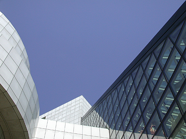
There's nothing in the photo leading me to believe this building is new....Maybe it's an old building.
Post actions
This is a very nice angle. I like how there are curved lines and straight lines and how you can see through the windows. The extreme whiteness of the building definately makes it look new and I love the color of the sky. I even like the fact that there are no clouds in it. The title could use a little work, but this isn't the "best title challenge" and it gets it's point across, so New Building, it is. Nice shot and good luck in the challenge.
Post actions
Nice strong angles, good color.
Post actions
Post actions
Ok, I am certainly no expert, but I just love this photo...The building frames the sky beautifully! Very nice pic :)
Post actions
More "new sky" than "new building" :-) The arrangement jars a little since there's no natural place for your eye to sit. Interesting shapes though.
Post actions
Interesting, effective composition. No one should question that it's a new building.
Post actions
Composition7
Post actions
Something new.
Post actions
Really like the color of the sky against the buildings. Nice.
Post actions
A little too much sky in the picture. Great angles, though.
Post actions
interesting but the main focal point to me seems to be a big blue sky...perhaps from another angle?
Post actions
Post actions
Is that the Rock & Roll Hall of Fame? I've photographed that spot before -- what a cool design! I like this composition.
Post actions
Nice composition. I love the variety of lines: descending, ascending and rounded. I give it a 8.
Post actions
Lovely. Toooo much sky for me though.
Post actions
Nice composition and form. 7 md
Post actions
Abstracts are always nice. Good contrast and positioning.
Post actions
Nice picture, but too much sky.
Post actions
Post actions
looks nice, but if you increased the contrast a little, it would look better in my opinion.
Post actions
I like the different diagonals you have going in this picture,





 Add photograph to your favorites
 Add photographer to your favorites


