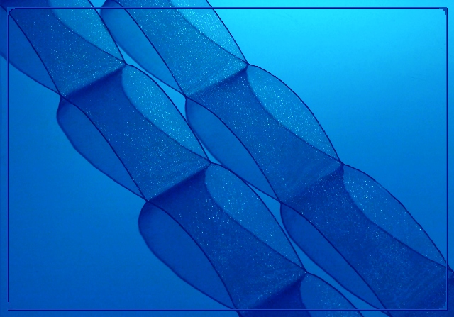
The shadows are soft, yet so well defined that at first glance they look like part of the objects instead of shadows. Very subtle. I find the frame distracting.
Wonderful! This is a good example to show that shadows don't always have to be black and dark. The lighting you set up is fantastic especially the way you have brought in a diagonal gradient. Something different, good show!
The subject of your photo is so ephemeral, so light, so subtle... HOW can you distract from it with that horrid frame? It competes so strongly; it ruins a marvellous shot. This trend of interior frames is NOT this photographs' friend. It should be a 9, but the frame steals from its integrity.
Thiis is really beautiful. If I had to nitpick I'd say I'm not crazy about the border; I think it would be better without the unnecessary details at the corners.







 Add photograph to your favorites
 Add photographer to your favorites

 Photographer found comment helpful.


