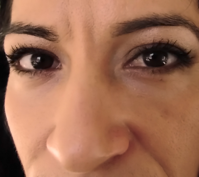
One of my good friends, Dora. I had her sit in a chair with sunlight from the window and a desk lamp on her face. Got super close-up with the camera. PP included crop, levels, contrast, despeckle, reduce noise, and a slight brown photo filter. Nothing to it!
Statistics
Place: 296 out of 306 Avg (all users): 3.8829 Avg (commenters): 2.5385 Avg (participants): 3.7423 Avg (non-participants): 4.0093 Views since voting: 891 Views during voting: 288 Votes: 205 Comments: 17 Favorites: 0
Camera Work/Technical: I'll have to agree with those that have already commented, the overall image looks a bit out of focus. The image is also over-processed in certain areas, the most noticeable of which is just underneath the eyebrows. Careful with post-processing. I'd also recommend looking into NoiseNinja or NeatImage. While it is easy to overdo it with these as well, they do provide a much nicer, overall cleanup.
Lighting: You did a nice job with a difficult lighting situation. Combing natural and artificial light often taxes the white balance settings on most cameras. In this case, the result looks fine.
Composition/Content: The image feels uncomfortable cropped the way it is. Chopping off the mouth looks like more of an accident than an intentional composition. I'd recommend cropping half the face vertically, including half the mouth and just one of the eyes. These shots often come out very well.
My Opinion: 3.88 is a tough score, but this site is all about learning. Take the comments and criticisms and apply them to your future images. While this one met the challenge well, I think the flaws were just a bit too noticeable.
First things first, be very careful with despeckle and reduce noise on portraits. They make skin look plasticy, which they have done here.
The lighting you used looks nice, although I think I can see you in her eyes, which is a bit distracting.
I know you were going for the eyes here, but when you get close to a subject you risk the dog-nose effect, making the nose seem disproportionately large. Would be better to step back and zoom more, which has the effect of flattening the image some.
A bit too much post processing. The smoothing has made the image look a little blurred, when you'd actually want more clarity and sharpness around the eyes.
Nor sure if you are trying to emphasize the brown tone all over or just the eyes? If you were trying to emphasize the eyes, I would like to have seen you crop closer to just the eyes. The softness or fuzzyness is a distraction and takes away from the point of the picture.
phew...this is not a good picture. focus on the nose, a bit too wide angle so now her nose looks HUGE! And you used either bad compression or a very bad job to try and soften the skin.





 Add photograph to your favorites
 Add photographer to your favorites

 Photographer found comment helpful.


