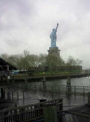
For all the obvious quality issues, and I must agree the tilted horizon seems more like a mistake than a point of intent, I think this is a fascinating compositional idea - I do like the way the complication and the widening zig-zag of the boards makes the statue seem almost irrelevant, incidental: this has a message, or the intent of a message. Good work, and not deserving of either that score or many of those comments.
A tighter crop, a longer lens or just getting closer would have eliminated the dark, underexposed foreground and focused attention where it belongs - on the statue.
I would have taken the shot from a different angle, I would like to see the Statue of Liberty from the front side, and more filling the picture. The idea is a really good one, although. :-)
It is not considered polite to stare (for too long) at a ladies behind ;). I think you are too far away from the lady. The foreground shouldn't be in the picture.
Sorry, but this one doesn't work for me. Out of topic, tilted, dull colors. Let's imagine Bartholdi's statue has grace, you could have focused your lens on some of the most gracious parts.





 Add photograph to your favorites
 Add photographer to your favorites


