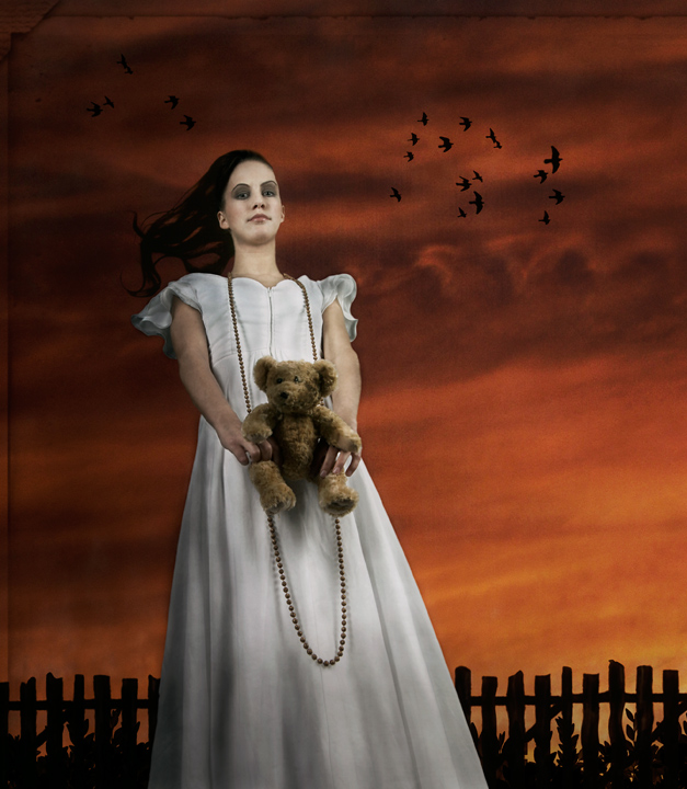
I was inspired by a poster I saw of Gone with the Wind, I wanted to recreate the colors of the sky. Tara is the name of Scarlet O'Hara's family plantation.
++++
I am pleased that DPC has introduced this new rule set, it is a large enhancement to the site and, in my opinion, long overdue. It only remains to be seen now how this first challenge goes down to see how widely accepted it will be. I have absolutely no idea how this kind of image will fare so I will be very interested in the result, good or bad.
Statistics
Place: 17 out of 123 Avg (all users): 6.7565 Avg (commenters): 8.4000 Avg (participants): 6.9444 Avg (non-participants): 6.6884 Views since voting: 3677 Views during voting: 1114 Votes: 271 Comments: 44 Favorites: 3 (view)
Thanks for all your comments and votes. This first "expert" editing challenge was fun. I will miss out the next few though until things settle down and some issues are sorted out.
Originally posted by nshapiro:
Very nice Gary! I'd love to hear a bit about the postprocessing... care to share? (I'm mainly interested in what you did in processing Tara, I love the look you are getting on your model's shots.)
To tell you the truth I can't remember exactly what I did. I can tell you though that I am keeping more and more away from filters now than in the past and using mainly on Photoshop tools like curves, levels, selective color etc and a lot of masking.
Very nice Gary! I'd love to hear a bit about the postprocessing... care to share? (I'm mainly interested in what you did in processing Tara, I love the look you are getting on your model's shots.)
Not a bad result when you have to go up against the usual high scoring landscapes entries. I'd love to see this rule set used where that isn't the case.
One of my four favorites. A great example of using editing to enhance the image without drawing too much attention to the editing itself. The image is lovely, and all the aspects of it work together to create a wonderful mood/feel. I think this is my second favorite in the challenge overall and that's 'cause I'm a sucker for rainbow colors, hehe. I really love this shot and I hope you do well!
All the elements in this shot are great and put together nicely. The lighting on the girl is great too. My only thing is my viewpoint being looked down on feels slightly awkward.
Gotta love how you have a BEAR in the shot (a relative of mine I believe) and nird silhouettes (I used them myself) — Synchronicity, a message from beyond :-) And, oh yeah, a really n ice shot. One of my faves.
Sometjhing weird going on with the way her right arm looks, is my only nit here.
I'd like to see this with just a little less starkness of contrast between the foreground figure and the sky ... I like the composition and the birds flying by.
A striking image. The picket fence is a little bit too perfect. Otherwise, it would be hard to find fault. Perhaps an old wooden bucket in her hands rather than a teddy bear ;-) to go with the rustic nature of the image. 9.
This is like a mix between Marylin Manson and Dorothy. Has an odd creepy feel to it. Has a strong feel of kiwiness to it but not his strongest work IMHO. I am sure this will do just fine though. Edit - I guess I am a moron as my wife tells me the reference is Gone with the Wind. So Marilyn Manson meets Scarlett Ohara. ;)
I've bumped my vote on this one. I've found that I'm really drawn to this unusual photo. The color with the contrast of the white and of course the totally awesome perspective make this a good/good/good shot!!!
Wowsers! This is really, really creepy. (in this case, that is a good thing) Really freakin' me out :-) Very cool processing, looks like a drawing. Wow. Just really ...creepy and freaky! Cool. The teddy bear is really adding to the creepiness. Cool, way, way cool. I am totally freaked out, but I like it. Nice job!







 Add photograph to your favorites
 Add photographer to your favorites


 Photographer found comment helpful.


