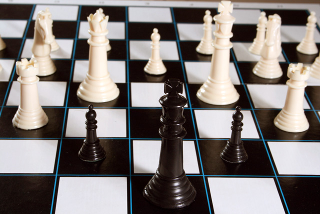
There are many social undertones that may be read into this photo, be they socila/racial. Is it the majority pressuring or dictating to the minority? Or vice versa.
The colour of the pieces is really irrelevant I feel, the image is simply designed to depict Majority Vs Minority in any way, shape or form. Sorry for the in depth analysis, but I couls see how this could easily become contraversial and that is NOT the intention........is it?
Depth of field is intentional in order to highlight the key characters.
Getting the lighting and focus right on this one was a real pain. Chequered black & white is definitely the best combination to confuse the AF and light meter.
This photograph is entitled "Us & Them", as in the track from "Dark Side of the Moon"
Statistics
Place: 122 out of 151 Avg (all users): 5.0330 Avg (commenters): 4.8750 Avg (participants): 4.6949 Avg (non-participants): 5.1634 Views since voting: 894 Views during voting: 298 Votes: 212 Comments: 12 Favorites: 0
I like the composition, but I think this would be a lot stronger if the whole chess board were in the photo. I guess this could have a deeper meaning as a social statement as well - not sure if that was your intent. 6.
The concept here isn't so bad. Besides the obvious interpretation of Us and Them that the chess board offers, there is also black verus white, male versus female, many against few, etc. So I think you started off with a decent concept.
Unfortunately your concept is then killed by a very poorly executed photograph.
First problem here is being able to see part of the table beneath the chess board in the upper right corner. That immediately screams "it's a sloppy shot and I just don't care".
I think the lighting could actually do ok as it is here. The way the shadows fall is sort of interesting, if they could be seen better. Increasing the contrast in the shot would help with this.
Focus is a big problem here. To me, you've not gone far enough with a limited depth of field. Either the white pieces should be more blurred or they should be in focus. Here, the foremost white pieces are just out of focus enough to look, well, out of focus. And not in a pleasing, fading-into-the-background sort of way. Just out of focus.
Angle this was shot at could also be changed and I think it would do the most towards really enhancing your shot as well as reinforcing the us verus the theme. If you got down a bit lower and shot this so the black king dominated the frame with a field of white enemies in the distance that would really look good. The angle used here just sort of looks like someone walked by a chess board and took a quick snapshot. Certainly any angle that hid the letters/numbers along the side of the playing area would be an improvement.
Again, I think you had a good idea here. You should spend some time shooting about a hundred different shots of it from different angles, change the lighting, change the setup of the pieces, etc. Find what really makes you go WOW and then that shot will probably make anyone else who looks at it go WOW as well. Well maybe. It is DPC after all heheh.
seems a little too "set up" or something, doesn't seem natural. Almost forced id say. Might have been cool if it was lined up perfectly, the lines that is.
This doesn't look like a position that could ever actually occur in real play... looks like the Black King has been calling "forward" from the rear too many times and all the front ranks have died!





 Add photograph to your favorites
 Add photographer to your favorites


 Photographer found comment helpful.


