adjustment layers (all normal, no masks):
-selective color (two layers)
-levels
-hue/sat (two layers)
-selective color (two layers)
-levels
-hue/sat
flattened
dust and scratches (1, 74)
resize somewhere in there, and save for web
original:
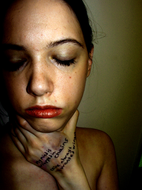
Lit with flash with a lightbulb in the hall where I was and in the next room. Camera was held with my other hand.
While editing, I learned the wonderful selective color technique of making blacks more black. I'm really proud of the post processing on this one. In advanced, I might have blurred the background a bit to get rid of some of the grain there, and almost certainly would have cloned out a few marks on my skin and the green triangle in the lower right. Editing was done on a laptop so I hope that I didn't get it too dark.
The starting concept originally came from the song "Point Me at the Sky" but I thought the final concept and the result fit better with "Childhood's End".
The words on my hand aren't song lyrics, but a verse I created fo
Statistics
Place: 47 out of 151 Avg (all users): 5.9074 Avg (commenters): 7.6154 Avg (participants): 5.6275 Avg (non-participants): 5.9939 Views since voting: 2270 Views during voting: 450 Votes: 216 Comments: 24 Favorites: 3 (view)
Yeah, definitely a very strong and emotional picture.
I wish I was an albatross! heh. Childhood's End is my favorite song by Pink Floyd.
"You awake with a start to just the beating of your heart.
Just one man beneath the sky,
Just two ears, just two eyes.
You set sail across the sea of longpast thoughts and memories.
Childhood's end,
Your fantasies merge with harsh realities."
Kelly, Very nice photo. I find this photo very intense and moody. I was surprised that this was a self portrait. You need to find some models so you can devote all your energy to one side of the camera.
Congrats on the 5.9 Kelly!
...barely got enough votes in to count on that challenge (need more time in the day just to vote -ugh). Too bad I didn't get to your submission :(
This is a very strong photo -- very Pink Floyd. I gave it a 9. Not sure why I didn't go all the way to 10, perhaps because it is disturbing to look at. But you got a lot of high scores and deserved them. (Who is that troll who leaves 2 on everything?) Good work, Kelly!
I must admit I didn´t vote this very high, gave it a 5 and solely for not being aesthetically pleasing, the WB you chose leads to less pleasing skintones and same goes for lighting, this is just not my cup of tea, sorry.
Disturbing image. Not my taste but certainly brings some emotion out and that is always a good thing. The dark line of shadow on the side of her face bothers me.
this is very disturbing and cool at the same time!!! very very good lighting. i wonder whether open eyes would have improved the shot. i like this nonetheless.
I really like this...has a real troubling quality about it...love the writing on the hand and the lighting...could see this in a magazine or album cover 9






 Add photograph to your favorites
 Add photographer to your favorites


 Photographer found comment helpful.


