ahhh, i think this should've placed higher. It looks like the cover of a book or movie, and there's an unmistakable sence of hilarity here...although I'm not exactly sure where it's coming from, lol.
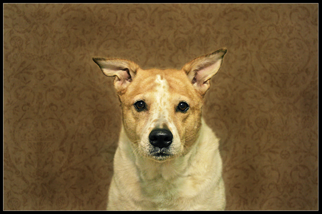
9 - Oh, this is very nice. Really like the simplicity and color choices, including background patterns. The horizontal framing works well, as would a vertical I imagine. Not sure on the black frame, but fairly minor. Could be just a visual thing but the left 'space' seems a fraction bigger / wider than the right. Looks like resizing issues, but just a little more detail / clarity in the eyes.. but likely there full size. Sure this looks good bigger. Seems some shadowing/something going on above V.'s crown/forehead, not sure. Up to 9 from 8. Really like the pose/capture.
looks like this is a tribute to the last pet portrait winner.
interesting shot and compositon, though i'd wish the background to be a little more blurred
There are a lot of things not quite right with this shot. The subject is too centered, vertically and horizontally. The crop of the body is weird. The ears flop awkwardly. The dog looks bored. The wallpaper is ugly.
The overall effect is a lot like the look of The Royal Tenenbaums.
Which is why it works so well. Two wrongs may not make a right, but it looks like a bunch of wrongs make for a great photo, or at least a distinctive style. 9
Omg.....this one reminds me of my grandmother!!! That is so sad....I hope she's not looking down on me from above on this comment! *grin* I'm liable to be thumped in the head!!! Love this shot! Love the expression! I think I might have cropped the top just a tad bit more....but, this is a great shot!





 Add photograph to your favorites
 Add photographer to your favorites


 Photographer found comment helpful.


