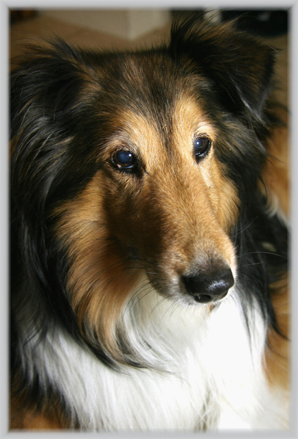
Lighting is very good on this Collie portrait - a nice soft lighting that plays softly on the colors of the dog and waves in it's long hair. I really like just off to the side frontal portrait pose of the Collie. It really shows off the beauty of this dog's features and colors. Not a big fan of grey borders that has faded lines (thought I am not going to dock you for that because it is minor). I think this could have done with a sharp line, high contrast border (thin line of white bordered by a thick black border or vice versa) for a clean, polished look. Last little critique is the top portion that shows the corner wall of a room could be cropped out without effecting the portrait negatively. It would in fact help it for that top portion does nothing to enhance the image. Yes, a closer crop would trim some of the ears but it would not be too noticable because the closer crop would keep the attention focused tightly on the facial features of the dog's face, and it is a beautiful face at that, so you should play it up and keep the eyes attention focused there.
Nice pose and crop. Lighting is mostly good; it looks like you blew out a good chunk of the white on the left side of the dog's chest but that might be on purpose. I would darken the pupils (they have a bluish cast) and maybe color the background stuff to be the same color as the floor (or clone it out or something) so it doesn't draw the eye away from the dog.





 Add photograph to your favorites
 Add photographer to your favorites


 Photographer found comment helpful.


