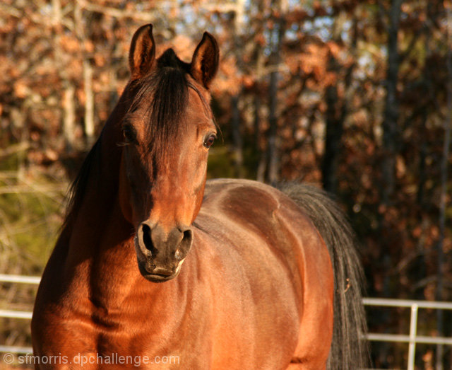
First off, beautiful horse! Love the reddish-brown tones on that shining coat. Now, onto the critique. I think that the composition would be strengthened if it was taken in a vertical orientation rather than the horizontal one here. Yes, we get to see the majestic beauty of this horse's body but you include too much background that detracts attention away from your subject. Give us a closer view of the head and neck with a little of the woods in the background. Lighting is also an issue. Time of day could be challenging to deal with especially when it comes to shadows and how & where they fall on your subject. The left portion of Amadorr's face is bathed in shadow thus we cannot see his/her face in entirety. The left eye is also in shadow - eyes can be windows into the soul and show us some expression (sadness, an intelligent twinkle, etc.). Without both eyes visibly prominent we only get to see 'half' of the horse's expression. A good composition with some strong bones that has the potential to move from the average to the above average with more attention on compositional framing and lighting.
5 - Could just be the perspective, but the angled fenceline is slightly distracting in my opinion. Like to have seen Amadorr pop a little more, via sharpness or use of lighting.
I like this composition. The lighting is good though I wish the shadow wasn't so dark on the left side of the horse's face. The focus is pretty good, though maybe could be a tad sharper.





 Add photograph to your favorites
 Add photographer to your favorites


 Photographer found comment helpful.


