Author Thread Comments Made During the Challenge
Post actions
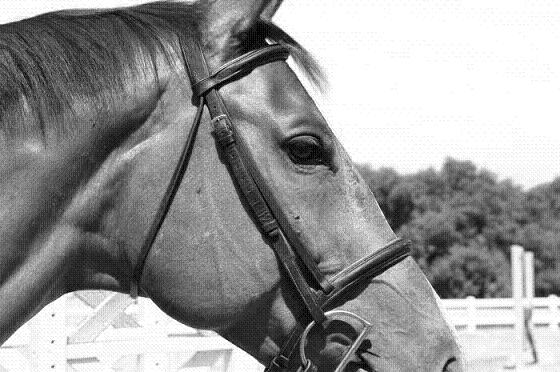
The frame is very awkward.
Post actions
For me, I would have scored this higher if the rest of the horse's nose and the ear were in the photo. I like the use of black and white though.
Post actions
3 - Not really a strong portrait in my opinion. Bigger, if you had the quality, make this better, plus obviously a variation in crop - unless this is intentional. Also, not sure 'what', but seems to be noise and lines/something in this image - could be pixelation issues.
Post actions
Post actions
i wish the nose wasnt cropped off
Post actions
this photo has a "linen paper" look to it ... like my resume does ... wish you'd fit your horse's whole head into the frame also ...
Post actions
Lovely study but its beauty begs for the entire mouth to be visible. 7
Post actions
Nice but the crop took of a good chunk of your subject's chin and ears. There also appears to be a pattern in the picture (from resizing maybe?)
Post actions
Why are the ears and nose cropped out of this shot?
Post actions
Would like to have seen whole head, not crop out ears and muzzle.
Post actions
Wow, don't have an opportunity to say this much around here but I think this is cropped TOO tightly.
Post actions
I don't like the texture too much..





 Add photograph to your favorites
 Add photographer to your favorites


