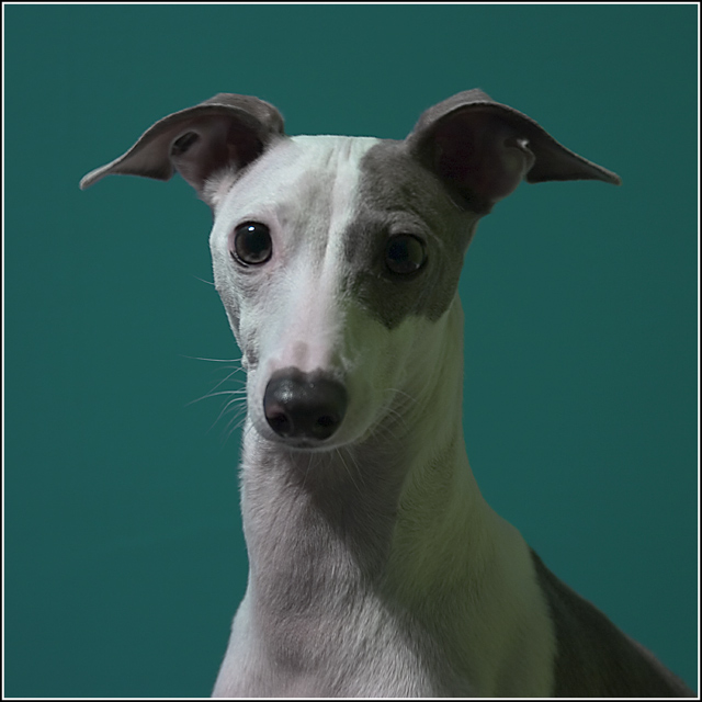
6 - Without looking, vaguely recall 'Stanley', don't think this has the same quality that that image does, in my opinion. Background color is nice, but like to have seen much more clarity/sharper on Stanley's eyes/face and more depth between him and the background.
Stanley really needs to shine but unfortunatly the poor lighting makes this composition flat. There seems to be a single light source off to the left causing a harsh shadow to fall on Stanley's right half. Illuminating the subject's face in entirety will strengthen the visual appeal and impact. The teal green background just is not allowing this greyhound to pop off the page. The color is dull and flat in color contrast and thus it does not allow the subject to visually pop. Hmmm, mayhap a lightsoure behind the dog would create a halo effect sort of what Arnit did in his photo called Caught Up //www.dpchallenge.com/image.php?IMAGE_ID=143446 . The photo has some strong bones but better lighting would really help it shine.
Stanley's back :) still a lovely pup...but your lighting was much better first time around. great backdrop choice, and the technicals are other wise very good. a solid entry...should score well.







 Add photograph to your favorites
 Add photographer to your favorites


 Photographer found comment helpful.


