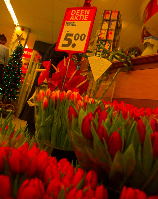
The image is nice, but here's a few suggestions. If you could get a clearer focus on the flowers (even if the price sign has to be less clear) that would make the whole photo seems less blurred.
Also, the yellow-orange tone seems to dull the photo. Instead of making the red flowers stand out, the whole thing, from the ceiling tiles to the counter is orange coloured and this detracts from the flowers. You could edit the photo in post-processing to make the rest of the image have a less orange tone.
That being said, I think the composition is interesting. I'm curious, what language is that on the sign?
I think a tighter crop on the sign and just a few flowers would keep this from being so busy. Everything to the left of the sign is unneccessary and doesn't add to the photo. Also, I think your white balance might be incorrect for the lighting.






 Add photograph to your favorites
 Add photographer to your favorites


 Photographer found comment helpful.


