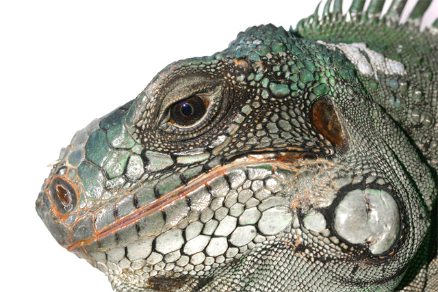
This is a wonderful close-up view of Jim. Love the textures and the details of this reptile portrait! But I think the choice of a white background did not allow your main subject to visually pop off the page. The white scales on his mouth & throat and those lovely greens on the crest of his head would pop visually if you had a higher contrast color. Here the hues get 'washed out' and blend in with the background. A Black background would have complemented the greens better. And white always pops out better if set beside a black because they are contrasting colors so Jim's white scales would be stunning bold against a black backdrop.
6 - Nice profile 'portrait' of Jim. Perhaps some more height in the frame, going for more of a square crop, may have given this an edge. Difficult, but the lighting the way it is, the white background isn't enhancing any of Jim's wonderful colors and textures, in my opinion.







 Add photograph to your favorites
 Add photographer to your favorites


 Photographer found comment helpful.


