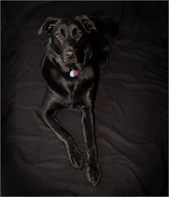
*Post* - Not my best effort and consequently not my best score. I think this is a great concept and maybe I will retry it for the boext black on black challenge.
Statistics
Place: 199 out of 378 Avg (all users): 5.5090 Avg (commenters): 5.9231 Avg (participants): 5.2815 Avg (non-participants): 5.7254 Views since voting: 943 Views during voting: 428 Votes: 277 Comments: 14 Favorites: 1 (view)
6 - Really like the set up and concept and lighting, but something is holding this back from being a stand out image.. not sure exactly what. Perhaps the framing, also the fabric a bit more subtle and the folds/etc selectively 'placed' and perhaps a more horizontal or square framing, not sure. There is some visible grain in the black fabric, so, as well as perhaps enhancing the dog, a selective softening/something may have helped to minimize that. Also, 640 would have helped.
This picture is very dramatic. I only wish those dog tags werent in the photo..I think it would be even MORE dramatic, without those taking the focus away. They dont take the focus away THAT much...so good job!
Love the sheen on the dog. The shine on it's black coat is what makes it stand out a bid more from its black background. One critique is that the black background really does not help the dog stand out. The dog gets almost 'blended' in with it's background when you really need it to stand out. As the main subject you want it to pop visually and be noticed immediately. You need a contrast of colors. For black the opposite contrast color is white. The overhead angle of the shot makes the picture seem a little odd - it either seems the dog is lying flat or standing on it's tip toe paw. Believe it or not the high angle seems to create a sense of great distance. Getting closer to eye level of the dog would help improve the shot because it also brings the viewer's perception at eye level and thus increases the the viewer's interest. The reason - because at eye level it draws us in such that one feels like they are there close enough to pet the dog.





 Add photograph to your favorites
 Add photographer to your favorites


 Photographer found comment helpful.


