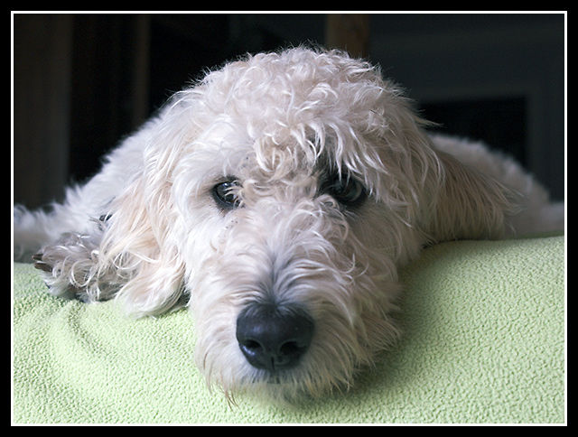
4 - The green fabric competes too much with the dog, as does the background. Sharper on the dog with a variation in lighting - especially for the eyes, make this better in my opinion. Frame is too thick for this image - again, in my opinion.
What a tired pooch! A nice portrait shot of this dog. I think that a vertical composition would have better suited this photo than the horizontal one. The reason, there is just too much 'empty space' floating on both sides of the dog that do nothing for the composition. The vertical one would better frame the sides of the head thereby keeping the attention more tightly focused on the tired dog.
Good detail on the face; might have liked it better it I could see the rest of the dog on the left (less centered composition to take advantage of the light going from left to right).





 Add photograph to your favorites
 Add photographer to your favorites

 Photographer found comment helpful.


