Cropped
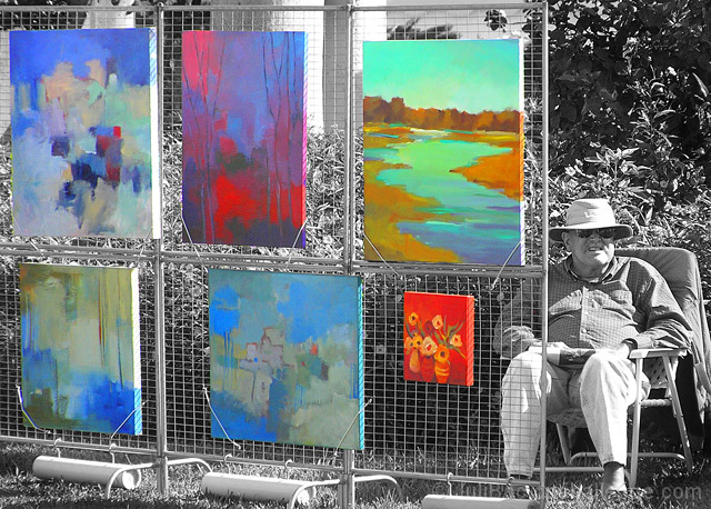
Changed to b&w using two Hue/Saturation adj. layers (one in color mode) for tone and contrast
Merged the b&w layers with a background copy layer and applied a mask for the spot color
Beneath the b&w layer:
Brightness/Contrast adj. layer
Hue/Saturation adj. layer to brighten paintings
Smart sharpened the artist; burned the edges; reduced size; slightly smart sharpened the whole image; saved for web.
Statistics
Place: 16 out of 120 Avg (all users): 6.0078 Avg (commenters): 7.9474 Avg (participants): 5.3889 Avg (non-participants): 6.1733 Views since voting: 1241 Views during voting: 362 Votes: 256 Comments: 25 Favorites: 1 (view)
Good selective desaturation really adds nice emphasis and subject color separation. It's colorful and interesting. Nicely done - I gave it a 9 during the voting, but somehow didn't leave a comment, so I hope you like this one.
Again, congrats on your plus 6 score! I know that was one of your goals for 2007, and you made it with time to spare. Look at that average from the commenters - almost an 8! And a favorite to boot.
I think this is one of those few instances where selective desat really works, because it has a specific purpose. (Obviously the voters agreed.)I also think your composition is quite good, and the title enhances the photo and helps tell a story.
The only suggestion I have would be a shorter DOF - I think the photo would be even stronger if the columns and trees in background were not as sharp.
this made me smile ... and the more i look at it the better it becomes .... really like the paintings if i dont look to close!! ... they create a nice contrast to the b&w of the rest of the shot ... love his expression ... actually its just a great entry in this challenge ... =9






 Add photograph to your favorites
 Add photographer to your favorites

 Photographer found comment helpful.


