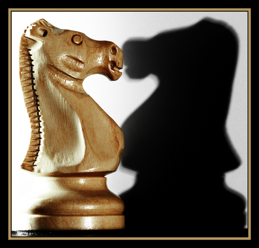
Not too bad of a showing, though I think this should have placed just a little better. I think too many missed the heart part. The symmetry really does work nicely. A little more breathing space, a tad less harsh lighting and a crisper shadow should have placed this in the top ten. It was a really great idea, very creative. I didn't vote, but had I, 8.
If this were exactly the same size without the border, I think it would've been a more comfortable fit. Its a little to squashed into the frame for my money
Very clever solution to the challenge, and a pretty picture besides. Reminds me a bit of the classic negative space demonstration (is this a picture of two knights or a gray heart?).
I like the idea of symmetry here. A more focused light could have made the shadow a little crisper. I think a little more negative space around the subject and shadow would help decrease the sense of being crowded.





 Add photograph to your favorites
 Add photographer to your favorites

 Photographer found comment helpful.


