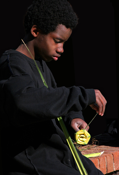
Taken on a street photo shoot in Charleston. A lot of background noise cloned out, slight adjustment to contrast, slight increase in saturation on rose. (Had to use a long DOF to get details in face and rose, but then background was too busy, so darkened it.)
Disqualification Details
You may not use ANY editing tool to move, remove or duplicate any element of your photograph that would change a typical viewer's description of the photograph (aside from color), even if the tool is otherwise legal, and regardless of whether you intended the change when the photograph was taken.
Yeah, a nice editing job, but too much of a change to get through without a DQ - I guess when someone saw a wall going to nowhere they requested validation.
I don't have much to add to the comments below. I like this a lot, especially his concentration and the lighting. I agree that the red in his face (especially his ear) is over saturated. I gave this an 8 during voting. It's a good photo for your portfolio, where the rules don't apply, because the black background is very effective.
This is really nice, so sorry about the dq. I love the composition - eyes follow body and lines right to the rose.
Lighting is great. I might possibly reduce the saturation of the reds in his face a tiny bit. The yellow and green against the black shirt really works well.
Maybe you would consider posting the original? Am very curious about the background now. It's so hard to tell how much is too much when it comes to this sort of thing.
Leaving aside the background, I think there are a couple things here. I would have liked to see all of his head in the frame, and the shadows cast by the right arm and the ear are a bit harsh. Other than that though I really liked this shot (and really I only noticed those things because I was looking for things that might have been "off" as you said). Like bmartuch's comment mentioned, there is a lot of emotion here - that was the first thing I noticed when I came across this image. I also really like the title - long titles have a way of being cheesy sometimes but that is not the case here. The title really brings things home for the viewer as far as connecting the visual to the challenge and also giving the boy some personality (by way of how you phrased the title).






 Add photograph to your favorites
 Add photographer to your favorites

 Photographer found comment helpful.


