You should try to use alternative lighting to avoid the brightness of the flash when taking these close-up photos. I have found that a normal 100W globe works well when suspended above the subject (especially if it is a still)
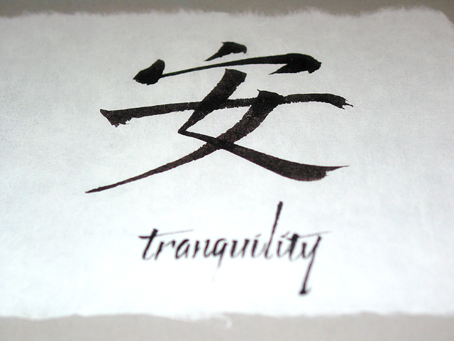
The calligraphy is very graceful, as are the edges of the handmade paper. I like your photographic depiction of this art; putting the english word slightly out of focus puts the center of interest on the chinese glyph.
I like this onem and the top beeing out of focus is good - but to me the out of focus text at the bottom is a littel disturbing - but thats my taste...
Why not, after all, oriental characters are generally very graceful. Choice of overexposing and blurring the occidental alphabet is cleverand well done.
Personally, I think you should have switched the focus on the word instead of the symbol. Also, I think it should have been cropped to where you couldn't see the frayed edges. Other than that, the lighting is really good and I enjoy the detail, nicely done.





 Add photograph to your favorites
 Add photographer to your favorites


 Photographer found comment helpful.


