Thanks for the comments and votes. Placed far better than I expected. This was an experiment with the vignetting ... not sure I like the look myself, but I have to try it out a few times to say "been there, got the T-shirt"...
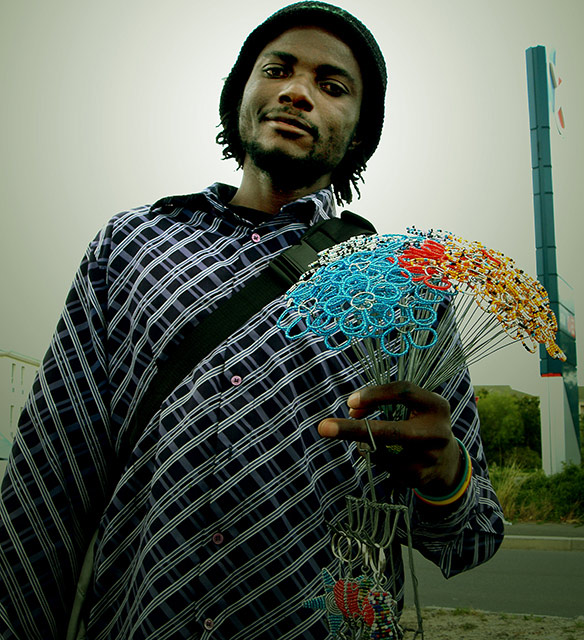
I kept the huge Caltex petrol sign in on the right to orientate the seller...contextualise him. I agree the top crop is too tight. Just struggled generally with how to crop for this one. I had 3 shots of him and then the traffic light changed and I had to move on. It was shot from my car window and I had to be quick.
He is selling bunches of flowers: they're made from wire and then trheaded with beads.
I need on of those in my .. wait - what the heck are those? the comp is great whatever it is. I wish there was just a smidge more space above his head.
Sense Appeal-10
Layout-10
Creativity-8
Applied Techniques-7
Meets the Challenge-10
Average-9 - I like the expression and the connection the subject is making with the camera. Great colors and definition. Don't like the darkening at the bottom of the shot, but the halo effect around him is very nicely done. The structure on the right side of the photo is a bit distracting as well. Would make a great ad for "kindness and sharing" :) That's the emotion I get from it.
Believe it or not, the title is important. I love the image, but your title is just a boring description. Also, you should crop that "sign" on the right out of this image, or next time turn a bit so that nothing behind the subject distracts from the focus of the picture.
Interesting image, but perhaps not technically perfect. It looks too much like a snapshot. The crop is close to the top of his head, the angle is low and tilted.
Its a good shot, and definitely fits the theme, but the shot feels underexposed and the tonal range has been cut severely. I wish there was more color in this shot!





 Add photograph to your favorites
 Add photographer to your favorites


 Photographer found comment helpful.


