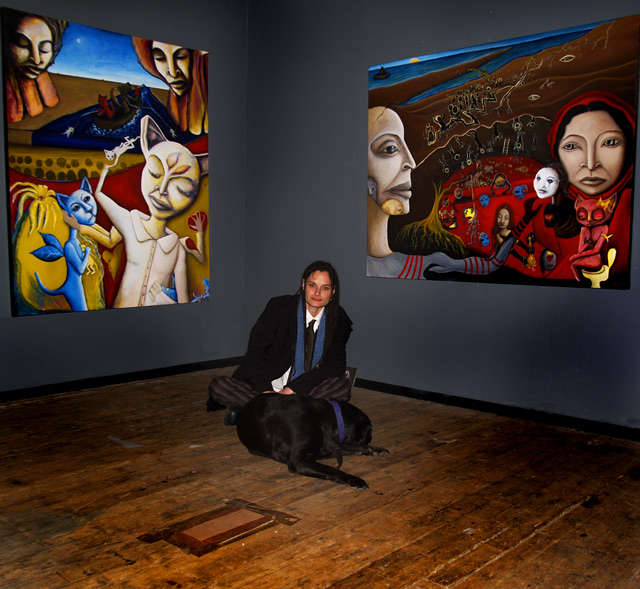
I love galleries - look at the floor folks! ... The floor! -- seriously, among this great artwork and the beautiful artist lies a floor - simply for smooth walking -yet little nooks and crannies, less perfect than anything in the room. 7
I really like the idea of this photo. But I think better lighting would have improved it. There are overexposed parts on the artists face. Nice paintings though.
OK! Seems this is dpchallenge, and I should mention the photo, which is pretty cool. The paintings are amazing, unbelievable, brilliant, heart-stopping. Please tell me who the artist is, I am 100% captivated. GL.
Interesting to note that the "models" in the paintings bear a strong resemblance to the artist in facial features. As a photo, this is "ok". Personally I think you could lose a fair amount of the bottom (flooring) part of this image. This would give the baseboard trim a little more strength as a divider for this composition. If you had to crop into the floor covering (cardboard rectangle taped to floor) some that would be ok, as any small portion left could be cloned out (advanced editing ruleset for this challenge). The burning on the lower right wall is a little too evident IMO (I understand you were trying to leave the center lighter to draw the eye toward the artist). Of course, all of the above is JMO. :D Good luck in the challenge.
Love the colors. I think it would be better if she were looking at the art rather than at the camera because, as it is, it gives the impression that it is a picture of a woman and a dog posing near some art, rather than a picture depicting something "For Sale." Nice picture, though.







 Add photograph to your favorites
 Add photographer to your favorites


 Photographer found comment helpful.


