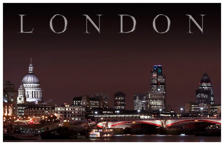
I like this even better than your challenge entry. The range of colors here adds a lot over the duotones presentation. Only thing I would comment on is the text seems to fall a bit flat in this version.
Now I like the color version better. I definitely would have voted this higher (I gave you a 6 sorry :-() but would easily have given it a 9 or 10. I think the color gives it a more 3 dimensional look whereas the blue version just looks like a jumble of lights and buildings. I have seen this view many times while living in London, GREAT shot.
Good choice in the blue-toned version I think. I never noticed the two light streaks, the red one in the building and the one on the road from what I am guessing is a double decker bus. Any idea what the streak is in the building? Anyways eitherway a great shot, but I could see this one losing some of your 8s to 7s.
weird I never even noticed it myself. easily cloned anyway! :-)
Good choice in the blue-toned version I think. I never noticed the two light streaks, the red one in the building and the one on the road from what I am guessing is a double decker bus. Any idea what the streak is in the building? Anyways eitherway a great shot, but I could see this one losing some of your 8s to 7s.




 Add photograph to your favorites
 Add photographer to your favorites


 Photographer found comment helpful.


