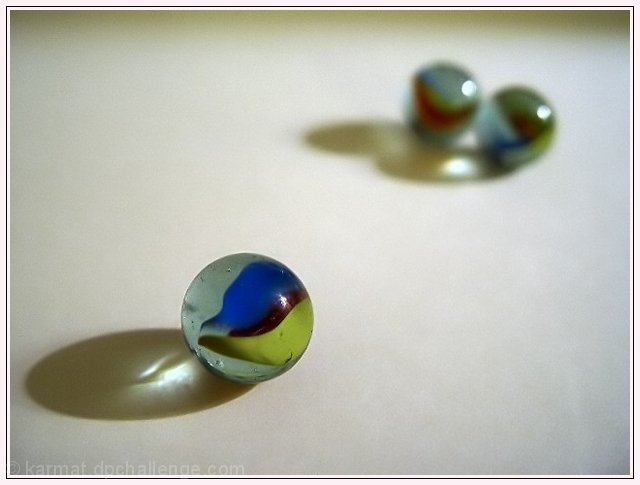
Composition - I think your idea is good. I would've like to have seen the back 2 marble a little more on an even horizon (for lack of a better word). The framing of the image makes me uncomfortable (again for lack of a better word) in that I don't feel that its balanced. Of course the front marble is the big focus point, so it should be closer and nicely focused, just maybe not quite so close and/or the back marbles could've been just a little closer. I think it would have been just as effective if they were a little more in focus.
Technical - I think you pretty much have it. Very very well taken.
Overall - The personification of marbles is a little difficult to deal with and stir any strong emotions in people to compel them to give you a great score. I think everyone who voted probably was capable of seeing what the point of this photo was. It just doesn't translate well from people to glass. There is one thought I had about the lighting in this photo, not to say that it's done poorly by any means. But that was to shorten the exposure somewhat and adding a little light to the 2 marbles only, to give a little more lighting induced mood. That might be completely preposterous, but it's just a thought I figured I could wing it out here and you can laugh at it or just ignore it as needed. Best of luck in the challenges ahead - Bob
Interesting image, I like the use of focus to help further alienate the single marble. Colors come out fairly well, lighting is nice too. I wonder how it would work with the focus point being reversed, if the same solitary feeling would be achieved. I think the border is a little distracting, mostly because its lighter than the background of the photo and pulls my eyes away. Nice image. 6
nice interpretation - that poor marble left out while the other two go off and play.
a more off matched marble may have worked a little better
the black sheep sort of... 7








 Add photograph to your favorites
 Add photographer to your favorites

 Photographer found comment helpful.


