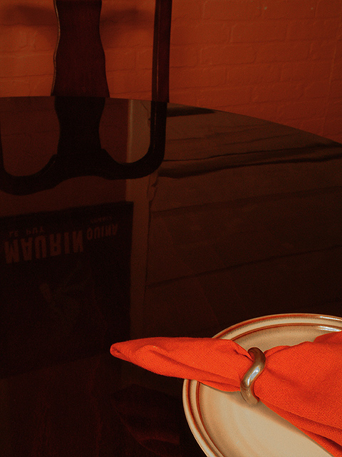
Nice warm tones. I like the composition - the empty chair helps support the lone diner theme. The low lighting boosts the mood as well. Good focus, though part of the napkin seems a bit soft - would rather that was completely sharp. A great image. 7
The wall's reflection doesn't seem to match the wall itself. The poster's relection seems out of place since we can't see the poster. Despite that, I like how you've composed the shot. Also, the colors are nicely done. 6
Nice graphic image. Applies alone very well I think without using what might be considered a normal subject for this challenge. I like the light and the composition.
Good idea this one. It gave you a chance to polish the table huh? I'm trying to read what is on the poster in the reflection, I can't work it out tho :-)






 Add photograph to your favorites
 Add photographer to your favorites


 Photographer found comment helpful.


