Caleb, my first impression was "Daym, you're good." My second might have been a little more polite, but would have said the same thing. YOu tell a fabulous story. Keep 'em coming.
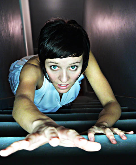
You still can't see her toes. It's another interesting photo with lots of opposites: mostly dark but her hand is blown out, mostly linear accept for the model (and even she is fairly linear). It is a striking photo. Good luck this week.
I like the expression in this image. I think the point of view is interesting and the lighting enhances it. Because of the lighting the right hand becomes, for me, the major feature of this image...its shape is interesting. However I feel that it is the element most in need of improvement because of the attention it draws. For me, it would be better if the hand did not so nearly merge with the edge of the image and, perhaps, a little more definition in it would be an improvement as well--a little more focus or just a little less light to help the features of the hand relate to the rest a bit more. Well done, nonetheless.






 Add photograph to your favorites
 Add photographer to your favorites

 Photographer found comment helpful.


