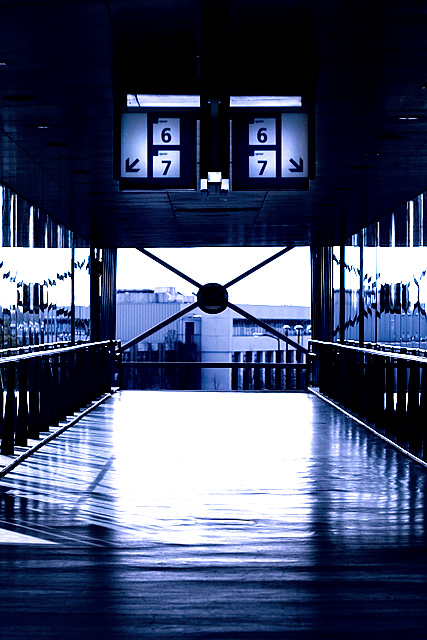
I also like the shot but it's missing something. For me this isn't really about the architecture so the symmetry while good isn't carrying the shot like it normally would. It's the signs hanging from above that changes it for me. Also that big X in the back, which can also be read as a 'sign'. Hence, the photo is really about the signs present more so than the architectual design of the building. That being the case I feel having a human element in the shot was critical. Even if it's just a motion blur of someone passing by the photo would have had a much bigger impact. Anyway, just my thoughts. I missed this shot during the voting but probably would have given this a 6 or a 7.
Edited to add, your editing is really good here. I forgot to mention that.
The blue toning is very good and i like the boldness of the shapes and lines. The upper half is black with no little to no detail and the lower is very light, almost white and i wish both areas registered some detail.
The symetry is perfect and it would look great printed BIG.






 Add photograph to your favorites
 Add photographer to your favorites


 Photographer found comment helpful.


