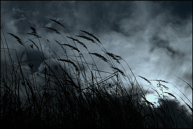
Shot on a cloudy Sunday in a bauxite mine. I don't think it will fly high, it's too dark for that (and I'm not speaking about colors), but I like it so I post it. For me the shot reflects the feeling of a Wednesday, hence comes the title (original was simply 'Wednesday' but I felt I should explain it a little more for the voters. For the purpose of conveying this particular feeling I had to change color tones from the original yellowish grey to this cold blue. (Some say it looks like moonlight, hope it won't drive the voters too far.) Besides this, only the common levels, curves, USM, resize and border were done.
Statistics
Place: 167 out of 501 Avg (all users): 5.9200 Avg (commenters): 7.1111 Avg (participants): 5.8252 Avg (non-participants): 6.1277 Views since voting: 1386 Views during voting: 239 Votes: 150 Comments: 10 Favorites: 1 (view)
I've come back to this several times. I really like the perspective and the diagonal line of the grasses blowing in the wind. I like the duotone coloration with that hint of blue.
I guess I should comment on this as its the sort of image many people will struggle to say anything about.
It conveys a gloominess, a dark mood, the title backs this up well. However, as a technical image it starts to struggle after this. There is not much to keep the interest of a viewer, nothing to make me wonder why you want to convey this gloominess. Its a 'OK lets move on' sort of image.
It is sharp enough and composed reasoably well. I just question whether its a 'competition' image.





 Add photograph to your favorites
 Add photographer to your favorites

 Photographer found comment helpful.


