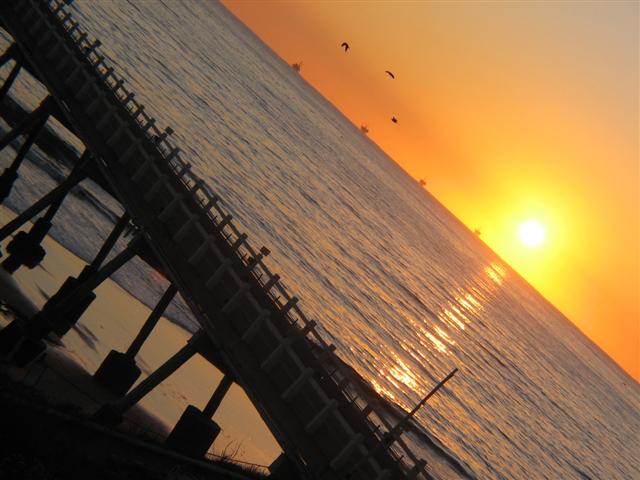
I didn't realize what a "dutch angle" was, and obviously, neither did most of the voters. Excellent entry for the challenge, I understand why you chose this style!
Thank you for actually tilting your composition - which seemed to be the thrust of this challenge that many people seemed to only distantly aim for. But it seems TOO angled & done so for the mere sake of tilting instead of as an aid to emphasize any particular portion of the photo. Horizon gets soft too - which wouldn't be bad except there's nothing really strong in the foreground to draw the eye's attention to. I'm pretty much a newbie here, though, so take my comments with a grain of salt - just 'cause I'm being critical doesn't mean I think MY stuff is doing any better! Good luck!
A tilted horizon is not wrong per se, but I believe it should be used carefully and for a specific purpose, for example to increase drama, to compliment an unusual perpsective, or to compliment at theme such as abstract shapes. In this case, to me, it brings nothing and indeed detracts from the viewing experience. I would like to see a 'straight' version of this, as I suspect it would have made for a more comfortable viewing experience, a better photograph, and would still have met the challenge!






 Add photograph to your favorites
 Add photographer to your favorites

 Photographer found comment helpful.


