Neat picture, good idea.
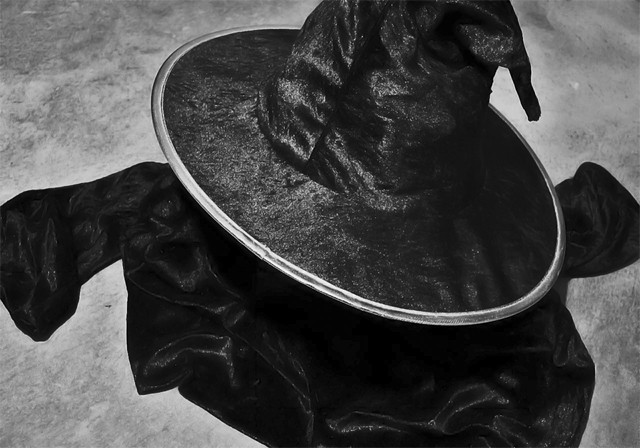
A couple things that possibly work against the image (as far as scores at DPC goes) are: (1) not everyone will make the connection to the Wicked Witch, and you are at least in part relying on the title for people to make the connection - it's gotta hit them in the face, the title needs to complement the photo, not explain it. (2) It's a black outfit melting into grey, and it just doesn't have enough appeal to captivate the audience. (3) The subject (robe/hat) looks a bit like a black blob, no detail.
Please don't get offended, it's hard to make constructive comments.
Maybe try different background and more dynamic lighting for a similar image. Maybe try not cutting off parts of the subject. Maybe in colour. I don't know, I think the idea has a lot of potential, but it would be good to experiment with different executions. |






 Add photograph to your favorites
 Add photographer to your favorites

 Photographer found comment helpful.


