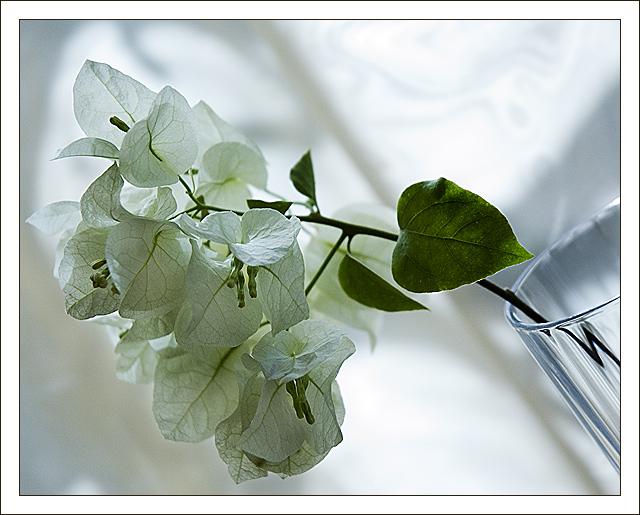
to much shadow takes away the whiteness of the background Pity for it is such a good detailed photo.so I feel I have to vote slightly lower than I would have liked, sorry
This is nice overall. Not sure that there's enough "white" in the background in terms of what this challenge is about for many viewers/voters. Personally I think it's "ok", but borderline. I keep finding myself looking at the glass on the right, it's really an attention getter. Did you consider using a white vase of white glass/cup instead? Just a thought. The way you've put this together is interesting using the angle that you have - it works just fine this way. Could have used it in the 'Diagonal' challenge as well. :D Best of luck to you in the challenge.
Very pretty, you'll probably get hit a little with the BG being varying shades of grey and white but you made a nice composition and did a good job with your focus.






 Add photograph to your favorites
 Add photographer to your favorites


 Photographer found comment helpful.


