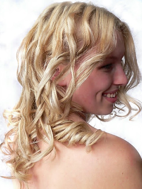
Likes: lighting on the hair, sharpness of the lines around the shoulder
Disklikes: the left of the frame is lost to the overblown white while the shadow on the eyes loses the key area of focus in a portrait.
Nice idea and beautiful model but the execution lacks quality. I'll try to give some hints:
- Her skin (especially her face) suffers from artifacts. Perhaps you saved the shot in a too low qualitiy? Try to reach the 150 KB border as close as possible to guarantee the best image quality.
- The image is oversharpened. Look at her hair and you will see some kind of "stairs" if you know what I mean. The hair becomes fringy and lacks smoothness. Sharpening less (especially when it comes to portraits) looks better.
- The blueish spots on the background are distracting. You can easily remove them by brightening those areas up till they become white.
- The most crucial point: Her face is too dark. When you look at the photo, what do you see first? Her hair, because it's the brightest part! But the essence of every portrait is the face. This is what a viewer should see first. While taking the shot you should have used a light to brighten up her face. You can compensate this issue a bit by making the face brighter during postprocessing.
A few things are holding this back, IMO. For starters the background has "clumps" of color that I can easily see. That tells me you brighten the background a lot in post, which is fine but the execution looks a bit sloppy. Also, the hair is a bit oversharpened. The rest of her however looks fine in that regard so perhaps pixelated hair was more of a result of the resizing down to 640 pixels? Lastly, the face could use some fill lighting, which a reflector would have fixed nicely. Overall not bad. The sheen in the hair looks really good and the model is very attractive.






 Add photograph to your favorites
 Add photographer to your favorites


 Photographer found comment helpful.


