| Author | Thread |
|
|
01/24/2007 04:03:00 PM |
|
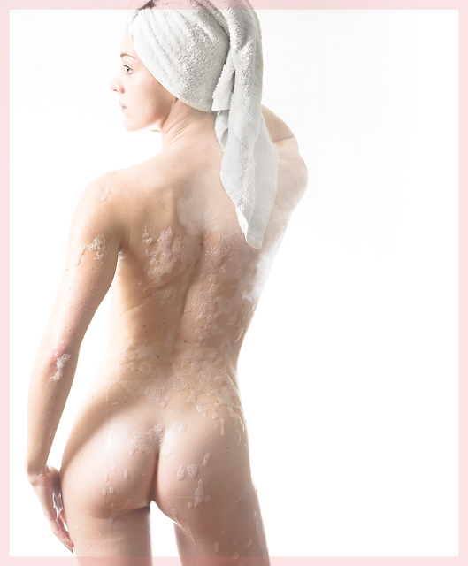
could you tell me what the set up was for this shot? and what the post processing was? |
|
 Photographer found comment helpful. Photographer found comment helpful. |
|
|
01/12/2007 10:19:56 PM |
|
I love how you made the skin bright milky smooth! |
|
| Photographer found comment helpful. |
|
|
12/07/2006 02:10:41 PM |
|
Damn that's a nice shot! Apart from her incredible body, I think the steam is pretty cool, too. Wish I was this good. |
|
| Photographer found comment helpful. |
|
|
12/04/2006 05:00:22 AM |
|
Very nice however I also have an issue with the border and i'm wondering if this would be better without the soap all over the model. For a nude, 6.2 in a non0nude challenge, not bad. Should have done better though I think. |
|
| Photographer found comment helpful. |
|
|
12/04/2006 03:15:36 AM |
|
Great result. I'd imagine this isn't easy to light. The border is a bit of a mix bag for me. I like it at the bottom where there is uniformity leaving the frame but at the top it feels too busy. |
|
| Photographer found comment helpful. |
|
|
12/04/2006 01:16:27 AM |
|
Great ass. Oops, I mean great ass. Damn it. What I'm trying to say is great ass. Ahhhh, nevermind. |
|
| Photographer found comment helpful. |
|
|
12/04/2006 12:30:01 AM |
|
As expected, a number of very low votes. But what the hell... look at what you've created. |
|
| Photographer found comment helpful. |
Comments Made During the Challenge  |
|
|
12/03/2006 10:50:20 PM |
|
Can't get much better than this. Perfect lighting, tastefully presented and a flawless subject all come tgether for a 1 of a kind entry. 10 |
|
| Photographer found comment helpful. |
|
|
12/03/2006 11:56:50 AM |
|
Beautiful capture, in far more ways than just a fine nude. |
|
| Photographer found comment helpful. |
|
|
12/02/2006 11:33:19 PM |
Likes: Good definition on the central back. I like the way the towel blends with the background, tying the model and background together. The eye is a prominent point of focus.
Dislikes: the pose feels contrived and forced, while the shadows of the arm across the back detract from the natural form of shadow there. The cleavage competes with the eye for attention. The highlights on the shoulders and between the arm and body detract from the overall form of the body. |
|
| Photographer found comment helpful. |
|
|
12/01/2006 10:57:46 PM |
|
Great pose and lighting, and beautiful model. The soap and her freckles add a great texture. The frame is the only thing that bothers me, it's too distracting. |
|
| Photographer found comment helpful. |
|
|
12/01/2006 05:50:31 AM |
|
Wow, sexy shot! The foam on her back looks a bit strange. Maybe more light would have worked here. Overall a great shot! |
|
| Photographer found comment helpful. |
|
|
11/30/2006 09:33:33 PM |
|
Tastefully done. I hope you score high. Great job. |
|
| Photographer found comment helpful. |
|
|
11/30/2006 09:09:31 PM |
Wow, very nice.
The body gets a 10 for sure. :) |
|
| Photographer found comment helpful. |
|
|
11/30/2006 04:11:42 PM |
|
I'm not really a fan of the pink frame, but I like the picture - very "clean" :) |
|
| Photographer found comment helpful. |
|
|
11/29/2006 07:07:14 PM |
|
Wow. And not jus tin the usual way. I love her placement in the picture and the lighting couldn't be better. |
|
| Photographer found comment helpful. |
|
|
11/29/2006 06:15:41 PM |
|
Although this is top notch technically, I can't help feeling the composition is not quite right. Too much dead space to the right, not enough to the left. 7. |
|
| Photographer found comment helpful. |
|
|
11/29/2006 03:29:56 PM |
|
that's just bootyfull. 10 |
|
| Photographer found comment helpful. |
|
|
11/29/2006 12:27:22 AM |
|
nice composition, great towel and L arm, eye is excellent but bubbles distracting. |
|
| Photographer found comment helpful. |
|
|
11/28/2006 04:13:53 PM |
|
not a bad idea. sorry I think that the pink frame is terrible... and distracting from the model's body. too white on the top of the model (on the skin) why? in advanced editing you can clear the moles whit the clone. 6 |
|
| Photographer found comment helpful. |
|
|
11/28/2006 11:24:27 AM |
|
nice shot..I wish you hadn't cut her head off...7 |
|
| Photographer found comment helpful. |
|
|
11/28/2006 11:08:04 AM |
|
Bold pose and shot. I like it, just a little bit washed out on the right. Well done and good entry. Good luck. |
|
| Photographer found comment helpful. |
|
|
11/28/2006 07:09:36 AM |
|
| Photographer found comment helpful. |
|
|
11/27/2006 11:43:13 PM |
|
In this case the cut at the top of the head does not work as well - maybe a fraction higher. |
|
| Photographer found comment helpful. |
|
|
11/27/2006 11:16:08 PM |
|
Well, I'm sure you're racking up the views. The thing holding this back IMO is the "white" isn't white, it looks yellow or beige. Good luck in the challenge. |
|
| Photographer found comment helpful. |
|
|
11/27/2006 03:52:55 PM |
|
I need to get this one out of the way so I can stop looking at it. Of course, beautiful model and interesting lighting. I like your border treatment - hightens the sense of voyuerism. The balance of the composition is very successful. Good photo.8 |
|
| Photographer found comment helpful. |
|
|
11/27/2006 07:19:55 AM |
|
| Photographer found comment helpful. |
|
|
11/27/2006 04:12:00 AM |
|
a tad *overexposed*. Cute, but lights on her left arm, her chin and bum are blown. border doesn't add. |
|
|
|
11/27/2006 12:24:22 AM |
|
| Photographer found comment helpful. |
Theme:
Classic /
Light /
Dark
Home -
Challenges -
Community -
League -
Photos -
Cameras -
Lenses -
Learn -
Help -
Terms of Use -
Privacy -
Top ^
DPChallenge, and website content and design, Copyright © 2001-2026 Challenging Technologies, LLC.
All digital photo copyrights belong to the photographers and may not be used without permission.
Current Server Time: 10/15/2026 05:13:14 PM EDT.






 Add photograph to your favorites
 Add photographer to your favorites


