The overall quality is less than your capabilities, I'm guessing! However, I love the lame, "cartoonish", throw-together aspects of this photo that I'm so "famous" for creating! This is a great advertising piece in which you're trying to sell by "opening a reader's heart" with a back-handed slap of humor! :} However, if this wasn't your intent then I just slapped myself in the face! :} Either way LAUGH & ENJOY!!!! :)
Uh-oh. I'm sure you are hearing this alot, but for these light on white challenges, it's pretty important to have a really white background, and a really white white :( Kind of a cute idea tho.
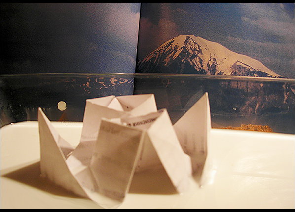
This just doesn't work. The lines are distracting, the paper thing in the foreground is out of focus and it relies on the title too much to make it fit the challenge.
Cute idea, but subject OOF, poor color balance, needs a little more preparation and thinking. B&W high contrast and a different angle might have helped.
I like the idea of a paper boat on a sea of milk with a mountain landscape. But your artifice is showing too much. I also think the boat needs to be in focus.






 Add photograph to your favorites
 Add photographer to your favorites


 Photographer found comment helpful.


