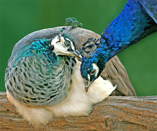
This photo was taken as a study in \"magic hour\" lighting, about one hour prior to dusk. Taken at Magnolia Plantation just outside Charleston. I was very happy to get this capture, as I didn\'t have a tripod and the light was quite low. I dodged some whites and adjusted contrast, shadows. I softened the background with Gaussian and added green tint, as original tanish color blended too much with peacock\'s back.
Statistics
Place: 418 out of 501 Avg (all users): 5.1154 Avg (commenters): 6.2500 Avg (participants): 5.0377 Avg (non-participants): 5.2800 Views since voting: 849 Views during voting: 214 Votes: 156 Comments: 9 Favorites: 0
I'd never have known you tinted the background - it looks perfectly natural to me which means you did a great job not only applying a tint, but picking the right one. I'd never even have thought of that. To me, it's just a little soft - I'd normally suspect camera shake (that's my problem) but I see you're using an IS lens. May have been just a bit of movement by the birds themselves. But soft isn't always bad - often it's a matter of taste.
Catherine, I think you did really well with the composition. The angles and colors are very nice. I agree with the score, though like Julianne, I'm having a little trouble figuring out exactly why. First, it could be sharper. It's a shot to be proud of, but to really pop, it needs sharpness. 1/50 was probably a little slow if they were moving, but I realize you were at dusk, so your options were limited, esp. as you were already at ISO 400. Try working with a wider aperture. I don't know how zoomed you were, but you might have been able to keep everything sharp even with a lower f-stop, which would've let you use a faster shutter.
Try this in processing: unsharp at 55, 1.4, 0. It seems to sharpen things up without too much haloing except under the male's neck. Since this is advanced editing, you can go in and erase that either by painting green or cloning a few pixels along that line.
I think you did a good thing making the background different from the tan, but maybe a reddish tint would've made the hen's top piece stand out more? Or make it darker.
One last suggestion: whens shooting, try different settings on multiple shots. Sometimes I'm surprised when I get home how much better an alternate setting works.
These birds are lovely and the pose is touching. The light is good. I gave it a 6, and I am trying to understand why it is lacking in impact. I think it is the green background. The peahen's colors are so soft that I think the green overpowers her. Also her topknot is not standing out well against the green. Really nice shot though.
Now that I go back and look at the details of the shot (should have done that first), I think that hand held at 1/50 may be what caused it to not be so vivid.
Really good composition and colors in this shot. My preference would lean towards sharpening this image more though, but that's only my preference. Good entry!





 Add photograph to your favorites
 Add photographer to your favorites

 Photographer found comment helpful.


